|
Darih | | 05/02/12 02:25 pm - Last edited 05/02/12 02:26 pm by Darih | Filter |
|

Dualer
 
Awards:
 
Group: Member
Posts: 226
| Well, the last time I played PT, and the last time I Saw for the Millionth(?) time all the Pokés that exist in this game, I noticed that the Sprites of the first Pokémons (pretty much all that can be seen/caught in the game, so far) are very simple, and raw... And all the other ones seem so professional and complex, I know that this game suffered a great change, over time, and it's under constant evolution, but I can't help to think that those first sprites should be enhanced! They look so... Old-ish (for lack of a better word)... :/
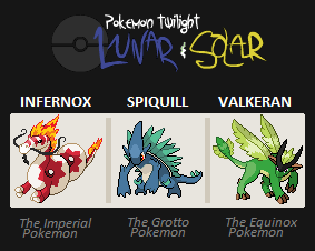
I personally think that, Reagle's line is a bit poor, and the water starter (I think its name is Urich, I chose Quenchi) too... Also, Infernox looks so far away from the other two, it's a bit too much, in my opinion.
Also, Mant looks poorly drawn too, but its evo looks way cooler! :/ It seems like almost every Sprite in the early stage of the game is poorly drawn... Even with the evolution they all took... (Yes, I saw the old sprites too in the PT Sim)... :/
Your thoughts...?
What do you think? Is there any PT Pokémon that seems odd to you? That you think that its sprite should be re-made?
------------
|
|
|
|
Coronation | |

Guild Member
     
Awards:
  
Group: Member
Posts: 833
| The backsprites for some of the older Pokemon are pretty outdated - even though the front sprites for many have been updated, some of the backsprites are awaiting completion. I believe that some of the older ones may receive updates, but I'm not sure how much priority is being given. I figure that the ones that have gotten updated sprites (like the starter's final forms) will get updates first.
------------
|
|
|
|
Bouncy Ball | |

Champion
  
Awards:
  
Group: Mod
Posts: 4057
| A lot of the sprites are being redone for a later update, but because it would look horrid if we added just some of the new sprites each update, they are being withheld until more are done. Don't worry, we know that the old sprites look different from some of the later ones in the game.
------------
|
|
|
|
Darih | |

Group: Member
| Man, it's good to know you're changing them! :P
HAHA!
Do you know if Infernox's gonna change? :P I like the concept, but I think that it is Eons away from the other two forms, I think it deserves an update to make him look like it's from That Line... :P It's too big of a jump, those two forms and then infernox is totally diferent xD
BTW, Coronation, Cool Avatar! :P Eventhough I like Umbreon the most :P |
|
|
|
Iasper | |

Dual Master

Awards:
  
Group: Member
Posts: 1099
| Infernox got revamped already.
------------
|
|
|
|
Darih | |

Group: Member
| QUOTE: TwilightDusk Infernox got revamped already.
Yes, I know, but will it be again? It still looks older than the others... :/ LOL |
|
|
|
Bouncy Ball | |

Group: Mod
|  Are you talking about this one?
 |
|
|
|
Darih | | 05/03/12 02:36 pm - Last edited 05/03/12 02:48 pm by Darih | Filter - Reply #7 |
|

Group: Member
| QUOTE: Bouncy Ball 
Are you talking about this one? |
|
|
|
Iasper | |

Group: Member
| Actually Searus has only two legs that turn into arms when it evolves. |
|
|
|
Coronation | |

Group: Member
| QUOTE: Darih Man, it's good to know you're changing them! :P
HAHA!
Do you know if Infernox's gonna change? :P I like the concept, but I think that it is Eons away from the other two forms, I think it deserves an update to make him look like it's from That Line... :P It's too big of a jump, those two forms and then infernox is totally diferent xD
BTW, Coronation, Cool Avatar! :P Eventhough I like Umbreon the most :P
Thanks  The stylized Espeon pic is the default one I use unless I feel like switching The stylized Espeon pic is the default one I use unless I feel like switching  And I understand what you mean by having such a radical shift. Infernox's sprite looks radiacally different than Searus, but I think instead of Infernox changing, Searus (and maybe Singet's) sprites will be updated to match the style.
 |
|
|
 Yollip Yollip | | 05/04/12 01:18 am - Last edited 05/04/12 01:19 am by Yollip | Filter - Reply #10 |
|

Guild Apprentice
   
Awards:
 
Group: Member
Posts: 445
Donor: 
| I dunno about you guys, but Valkeran really chaged... alot!
Like the sprite was okay before, but now it has a whole new
look and perspective! I really looks great now - I really like it better! :D
------------
|
|
|
|
Darih | |

Group: Member
| Valkeran is the best sprite from ALL the starters, IMO... :P
It's a good design, simple, and it's easy to the eye :P But I think that the Lighting could be better, especially on the torso, that roundish thin in the back leg makes it look a bit weird :P
LOL But it's still the best one from all of the starters... |
|
|