|
Hidro | | 06/25/11 04:34 pm - Last edited 07/09/11 06:18 pm by Hidro | Filter |
|

Trainer
     
Awards:
  
Group: Admin
Posts: 133
| Okay, here's the skinny. A new update for PT is in the works, and we want it to be the best possible. I've been working on new Pokemon designs with the occasional revamp, but I don't have time to give EVERY sprite the revamp they deserve in this update. So I'm looking to you guys for help. I am not asking for revamps. (You are welcome to DO a revamp if you like, but don't change the design of the Pokemon without my approval. And I can be pretty picky.) I am asking for recolors. I really want to incorporate the community as much as possible into this project, and I think this is a good first step.
What I Am Looking For
--> Kill the rasterization. We all hate it.
--> Delumpify outlines (the trickiest part, IMO)
--> Desaturate the colors. Just a tad.
How This Should Work
Pick one of the Pokemon listed on the first page of this topic. Recolor it. Repost it in this topic. Get feedback. Make changes. Get feedback. Make changes. You know the drill. Not everything you post will be accepted immediately. If you are willing to work with me and others on taking feedback, you'll get the sprite looking great. I believe in you. The final call comes down to Me, GF and Kabob. I'm counting on the experienced spriters to help out with feedback so that even beginners can get a chance to do good work. Note that this is a temporary fix until every sprite can get an honest revamp. But that could take a VERY long time, especially while I focus on adding new Pokemon.
Rule #1: ONLY the pokemon listed in this topic are available for recolorations. If it isn't on the list, that's because it is most likely in line for a revamp or somebody has already recolored it.
Rule #2: Don't revamp the Pokemon and make as few alterations to it as possible. If I don't recognize it, I probably won't approve it. Stick to the outline as much as humanly possible.
Hm. I guess that is pretty much it. Here are the candidates up for recoloration: 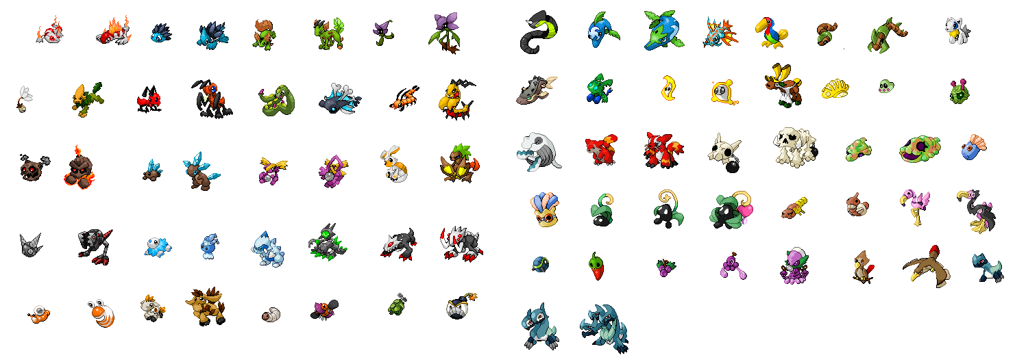 Here's the list. I'll strike the names as they are completed:
Singet
Searus
Urich
Anemoned
Quenchi
Althorn
Lileef
Mayflower
Dandaloft
Welion
Mant
Termight
Sleaf
Dessafish
Minipede
Multipede
Metemite
Astroidus
Spickle
Dribbik
Vatick
Occulet
Koda
Junzu
Lolzie
Mechasnap
Boreal
Glane
Glinde
Xiox
Darusk
Deadron
Scrug
Gussle
Gillup
Algar
Maggatot
Fluzzer
Garboom
Kablast
Cesleok
Doltopia
Parafin
Ribian
Tucore
Warmy
Worgeddon
Raow
Grugeon
Zigger
Flote
Glowm
Caribell
Lemorang
Myraid
Hybrian
Bayleena
Raphyre
Raphlaze
Onimark
Gronimus
Mog
Marog
Swili
Squnge
Springling
Sprangling
Hartoom
Gorva
Skeever
Flumboyant
Pompiingo
Rotato
Chilibre
Vhine
Plooze
Dionius
Harrow
Harroc
Cryon Just realized that these guys aren't really rasterized.
Cruo
Cragon
And here is a VERY basic tutorial for what sort of changes I expect on a recolor:
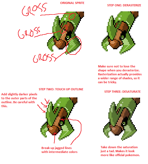 Also, most of these Pokes are in DRASTIC NEED of updated backsprites as well. I'll get a list up of back sprites in need of recoloration ASAP.
Thanks for any help you can render, guys. The next PT update will be awesome.
 |
|
|
|
Iasper | | 06/25/11 06:09 pm - Last edited 06/25/11 06:27 pm by Iasper | Filter - Reply #1 |
|

Dual Master

Awards:
  
Group: Member
Posts: 1099
| No Cosmite?
I'll try Mechasnap out :D
Redo:
 I'm not really sure about the colors and I just can't sprite, but I got a feeling this is a start.
------------
|
|
|
|
Hidro | |

Group: Admin
| QUOTE: TwilightDusk No Cosmite?
I'll try Mechasnap out :D
Redo:

I'm not really sure about the colors and I just can't sprite, but I got a feeling this is a start. |
|
|
|
Bzhuan | | 06/25/11 07:23 pm - Last edited 06/25/11 07:24 pm by Bzhuan | Filter - Reply #3 |
|

Graduate

Awards:
 
Group: Member
Posts: 191
| 
------------
|
|
|
|
Bouncy Ball | | 06/25/11 08:22 pm - Last edited 06/25/11 08:25 pm by Bouncy Ball | Filter - Reply #4 |
|

Champion
  
Awards:
  
Group: Mod
Posts: 4057
|  i haven't really changed the colors yet... i haven't really changed the colors yet...
------------
|
|
|
|
Hidro | |

Group: Admin
| QUOTE: Bzhuan
They are a good start, but I have some suggestions. The intermediate pixel color you used on Multipede's face dosen't look like the right color. Those tiny pixels are supposed to blend the colors together, so they have to be an intermediate color and shade. The blender pixels you put around the shiny spot on Multipede's face look desaturated, when they would probably look better (in this case) as just a darker shade of the same color used in the shiny spot. Also, you've used that same color on the right edge of the face. I don't think it needs the highlight there. To blend with the outline you need a darker shade than you did with the highlight. Look at my little Worgeddon tutorial to get a better idea for how to smooth the lines with intermediate pixels.
On Quenchi you added highlight pixels to the tail that make it look like it has been beveled. I would get rid of that. I think the effect you were going for was to smooth the outline, in which case you need to change the colors of the line itself, rather than add pixels to the sides (if that makes sense). If I get a chance I will post some pictures that illustrate my point. It is really hard to describe.
The real trick to getting these right is in working with the outline. Knowing where to add shade to it and how to smooth it out and stuff. It can be a real challenge. If you don't understand this blurb, feel welcome to ask for a better explanation =P |
|
|
|
Hidro | |

Group: Admin
| QUOTE: Hidro QUOTE: Bzhuan 
They are a good start, but I have some suggestions. The intermediate pixel color you used on Multipede's face dosen't look like the right color. Those tiny pixels are supposed to blend the colors together, so they have to be an intermediate color and shade. The blender pixels you put around the shiny spot on Multipede's face look desaturated, when they would probably look better (in this case) as just a darker shade of the same color used in the shiny spot. Also, you've used that same color on the right edge of the face. I don't think it needs the highlight there. To blend with the outline you need a darker shade than you did with the highlight. Look at my little Worgeddon tutorial to get a better idea for how to smooth the lines with intermediate pixels.
On Quenchi you added highlight pixels to the tail that make it look like it has been beveled. I would get rid of that. I think the effect you were going for was to smooth the outline, in which case you need to change the colors of the line itself, rather than add pixels to the sides (if that makes sense). If I get a chance I will post some pictures that illustrate my point. It is really hard to describe.
The real trick to getting these right is in working with the outline. Knowing where to add shade to it and how to smooth it out and stuff. It can be a real challenge. If you don't understand this blurb, feel welcome to ask for a better explanation =P QUOTE: Bouncy Ball  i haven't really changed the colors yet... |
|
|
|
David | |

Pyco Artist
    
Awards:
  
Group: Member
Posts: 704
| You made a good guide on how to recolour but in order to colour and shade it right, the outline needs to suit the shadow as well. Everything works together. Your example with Worgeddon had a good original outline so it worked but there are heaps other sprites that may need their outlines redone in order to utilise correct shadow application, or in other words just a complete revamp. Just a little tip, don't use intermediate colours that often. If it's between two shades of the same colour, there's generally no need unless for example the pokemon's skin has a furry or fluffy texture etc. Yeah, just saying. Recolours are only one aspect of a sprite revamp, but outlines are important too so don't forget about it completely.
------------
. |
|
|
 Lody Lody | |
League Master
    
Awards:
   
Group: Member
Posts: 2135
Donor:  $250.00 $250.00
| here's a quick recolour of urich using your tutorial.
not sure if I was meant to fix up the eyes.
I did recolour some of the spikes (changed some black shading to a darker colour)
and also not sure if I used the right amount of desaturation.
anyways here it is:

------------
|
|
|
|
Bouncy Ball | |

Group: Mod
|  I had done an urich too but only put it up on the shoutbox... this was mine.
 |
|
|
 Lody Lody | |
Group: Member
Donor:  $250.00 $250.00
| yea, I was bloody upset about that.
post it first next time.
few precious minutes of mine wasted! |
|
|
|
Bouncy Ball | |

Group: Mod
| lol soooooooorry D: |
|
|
|
Iasper | |

Group: Member
|  I think this one looks alot better, even though I think I messed up the colors when decreasig saturation.
 |
|
|
|
Hidro | | 06/26/11 05:36 pm - Last edited 06/26/11 05:47 pm by Hidro | Filter - Reply #13 |
|

Group: Admin
| QUOTE: David You made a good guide on how to recolour but in order to colour and shade it right, the outline needs to suit the shadow as well. Everything works together. Your example with Worgeddon had a good original outline so it worked but there are heaps other sprites that may need their outlines redone in order to utilise correct shadow application, or in other words just a complete revamp. Just a little tip, don't use intermediate colours that often. If it's between two shades of the same colour, there's generally no need unless for example the pokemon's skin has a furry or fluffy texture etc. Yeah, just saying. Recolours are only one aspect of a sprite revamp, but outlines are important too so don't forget about it completely.
Yeah, good points. The intermediate shades should only be used if an edge looks rough; if you get crazy with intermediate colors it makes the sprite look padded and not very attractive. I don't really mind at ALL if people adjust the shading of the outlines OR the body (though I want the color schemes to remain the same) and even small tweaks to the outline are acceptable. I'll have to post an outline shading guide specifically when I get a chance. When I get a chance, I plan to give all the sprites a revamp. But that simply isn't going to be possible for the next release or even any time soon, so this gives everybody a chance to pitch in to make the next version awesome.
QUOTE: Bouncy Ball 
I had done an urich too but only put it up on the shoutbox... this was mine. QUOTE: TwilightDusk 
I think this one looks alot better, even though I think I messed up the colors when decreasig saturation. |
|
|
|
Bzhuan | |

Group: Member
|  |
|
|
|
Iasper | | 06/27/11 07:34 am - Last edited 06/27/11 07:35 am by Iasper | Filter - Reply #15 |
|

Group: Member
| QUOTE: Bzhuan
Mant looks way too light, while Spickle and Dribbik became blockier. Hidro told everyone to make as little changes as possible. Nonetheless, they look great, especially Termight :D
Anyway, about Welion - I don't really get what you're saying, so could you fix them? :)
Anyway, decided to do some more:
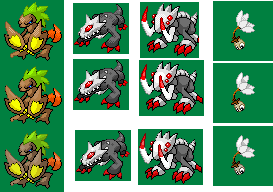 I hope I didn't decrease the saturation too much, because Junzu looks completely different. I find them pretty good nonetheless (at least better than Mechasnap) :D
Also, I think I use way too much dark pixels.
 |
|
|
 Lody Lody | | 06/27/11 10:59 am - Last edited 06/27/11 11:00 am by Lody | Filter - Reply #16 |
|
Group: Member
Donor:  $250.00 $250.00
| Seeing as Bzhuan's Spickle and Dribbick didn't turn out so great, I decided to have a go and made a decent effort to make them look good.
Here they are:

 left-to-right: de-saturated/normal saturation/original
 |
|
|
|
David | |

Group: Member
| tried some edits. hope i didn't change the original design too much:
 |
|
|
 Lody Lody | | 06/27/11 12:06 pm - Last edited 06/27/11 12:08 pm by Lody | Filter - Reply #18 |
|
Group: Member
Donor:  $250.00 $250.00
| =O
I absolutely LOVE what you did with dandaloft!
I want your babies! (willingly or otherwise)
nah jks but still dandaloft is absolutely awesome, I like how you made it less "green" and fresh, and more old and dead-ish.
edit: you probably could improve dandaloft a bit.
 |
|
|
 Game Fortress Game Fortress | |

The Big Cheese
   
Awards:
  
Group: Admin
Posts: 425
Donor:  $0.01 $0.01
| QUOTE: David tried some edits. hope i didn't change the original design too much:

------------
|
|
|