|
Pazaza | |

Dualer
 
Awards:
 
Group: Member
Posts: 210
| QUOTE: TwilightDusk 
Typing is up for debate.
------------
WHAAAAA....!!???! |
|
|
|
mechasnap-is-awesome | |

Trainer
     
Awards:
 
Group: Member
Posts: 113
| with the holiday event where u get to go to the north pole did that have to be done on the 25th
------------


My Achievments
Got Mechasnap
...thats pretty much it... |
|
|
|
Iasper | |

Dual Master

Awards:
  
Group: Member
Posts: 1099
| No, you can do that during December.
------------
|
|
|
|
mechasnap-is-awesome | |

Group: Member
| oh cos when i go into to mystery gift it just says happy holidays and thats it. |
|
|
|
Iasper | |

Group: Member
| Check your bag, there should be a Winter Ticket in your key items pocket. |
|
|
|
mechasnap-is-awesome | |

Group: Member
| thanks TD, and also do u know if the amulet coin works or not |
|
|
|
Iasper | |

Group: Member
| I'm not sure but I think it does. |
|
|
|
mechasnap-is-awesome | |

Group: Member
| nah the amulet coin does't work which is unfortunate |
|
|
|
Bouncy Ball | |

Champion
  
Awards:
  
Group: Mod
Posts: 4057
| 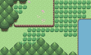 This is the first reveal of the overworld sprites I have been working on.
------------
|
|
|
|
Darih | |

Dualer
 
Awards:
 
Group: Member
Posts: 226
| It looks like a early pokemon game, I dont know why, it looks like it is not as detailed as the graphics in the last version...
I was expecting something more vivid and complete, actually, not something this plain...
I hope it isnt finished, I would like to see some detail on the water, and the grass too :P
It's not bad, actually, I was just expecting something else... :P
Keep up the good work :)
------------
|
|
|
|
David | |

Pyco Artist
    
Awards:
  
Group: Member
Posts: 704
| hey, that looks awesome BB! original/overworld sprites and tiles is what PT truly needs! ;P
------------
. |
|
|
|
Bouncy Ball | | 01/09/13 01:56 am - Last edited 01/09/13 02:17 am by Bouncy Ball | Filter - Reply #551 |
|

Group: Mod
| Thanks all.
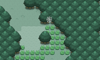 This is the second reveal of the overworld sprites I have been working on.
 |
|
|
|
Iasper | |

Group: Member
| I think the tall grass is a bit too light here compared to the background and the trees, good work though! |
|
|
|
GoldenGoshawk | |

Pyco Artist
    
Awards:
 
Group: Member
Posts: 697
| Wow good work :D
------------
|
|
|
|
Darih | |

Group: Member
| I still think it is too plain... :/ Is it just me? Doesn't it look too simple and empty?
I like the web detail, though, very nice addition :P
:)
Keep working on them :D |
|
|
|
radiant17 | |

Guild Member
     
Awards:
 
Group: Member
Posts: 978
| QUOTE: Darih I still think it is too plain... :/ Is it just me? Doesn't it look too simple and empty?
I like the web detail, though, very nice addition :P
:)
Keep working on them :D
I don't think the tiles are too simple at all. For things like grass, simple is necessary. Otherwise, it will start to distract the player. Plus, the emptiness can always be remedied with the addition of things like flowers and rocks, which would be added as separate tiles.
However, I do think that the tall grass might possibly look better as a single patch, as opposed to the individual tufts currently in use. But that is just my opinion.
------------
Ask me about my current game project, Creatures! |
|
|
|
Bouncy Ball | |

Group: Mod
| 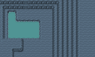 This is the third reveal of the overworld sprites I have been working on.
 |
|
|
|
Iasper | |

Group: Member
| I think the left and the right side are a bit weird. They don't fill enough space and when stacked, like the very right on the image, it looks somewhat weird because of the gaps. Great work though! |
|
|
|
Pazaza | |

Group: Member
| Shouldn't you move away from Pokemon looking sprites? Honestly, these don't really look all that different. Good Jon though |
|
|
|
David | |

Group: Member
| these look amazing, can't wait to play them! |
|
|